What's Unique About AirNav Radar
Features that you'll only find on AirNav Radar
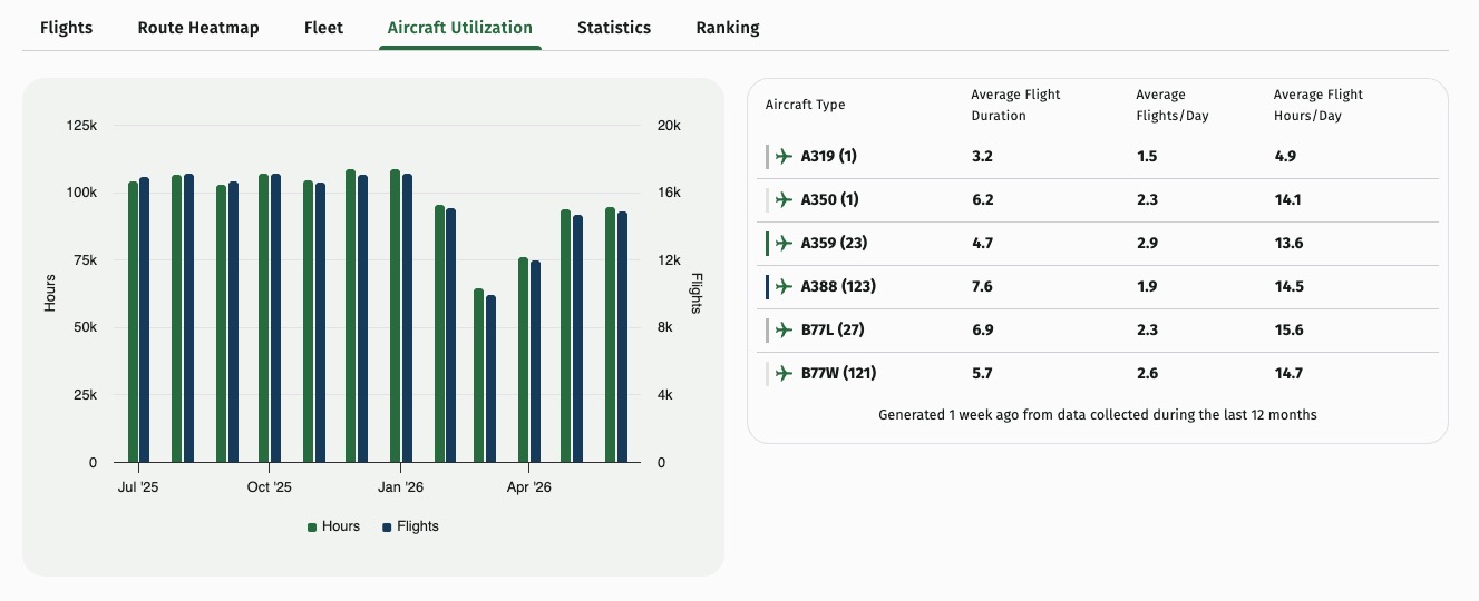
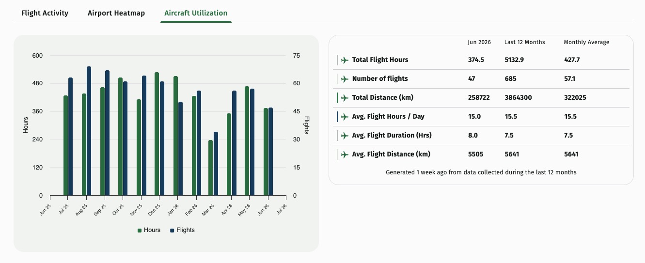
These graphs show the monthly flight time and the total number of flights that an aircraft has taken (based on registration number). Users can also view figures with various metrics such as the average flight duration or the total distance flown (in nautical miles) for the past 12 months and the monthly average.
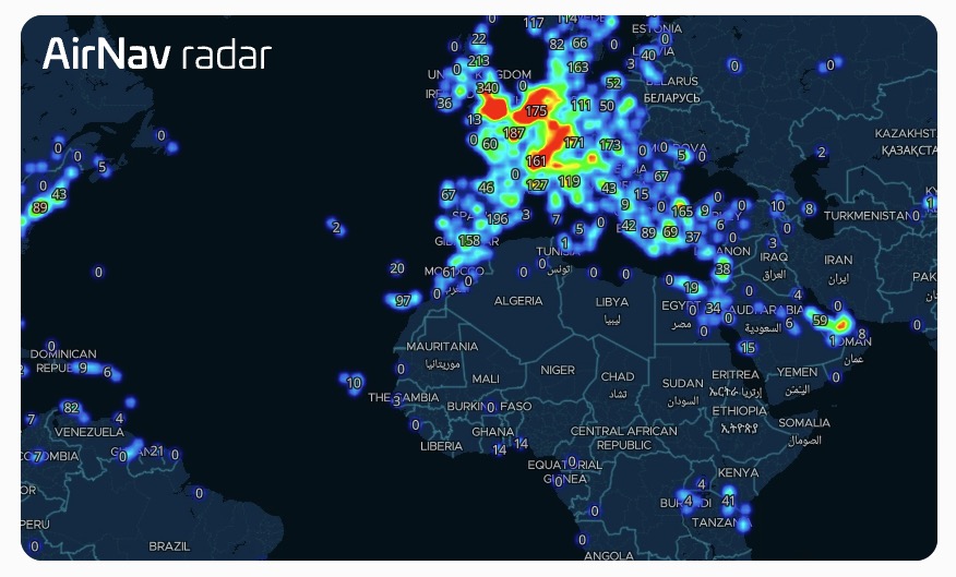
Movement Statistics display the total aircraft traffic (arrivals & departures) at a particular airport for each day for up to 31 days. Airport Heat Maps convert the dry and drab route statistics into informative visualizations. Essentially, the route heat maps display the frequency of flights to different airports or cities from a particular originating airport. Destination airports where the frequency of flights is higher are shown in red or orange, whereas destination airports where the frequency of flights from the originating airport are lower are shown in light green or yellow.